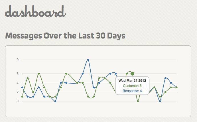
I've replaced the graphing software on the dashboard, so the graph that shows messages (and responses) by day is much clearer. Before if there were the same number of customer messages and responses on the same day they would share the same dot, and seeing numbers by day was just a mess.
So here's the new hotness. All you need to do is run your mouse over a dot, and you'll get a summary of the number of customer messages and their responses (This below is just a picture and you can't interact with it).

If you don't see a graph in your dashboard, look for a link at the bottom of that page that says "I don't need this welcome page anymore. Take me to the regular dashboard." That will swap you to it and you'll see it from now on when going to dashboard.

